Aller au contenu
Cross Sud Ouest
Projet

Cross Sud Ouest

Année · July 2027Sports event

Technos

En bref

Identity and readabilityPurposeful motion
Running
Motion
Project management
Rôle

Product framing, React/Tailwind/GSAP front development and ClickUp steering for a race showcase that stays readable through race day.

Le terrain

Contexte

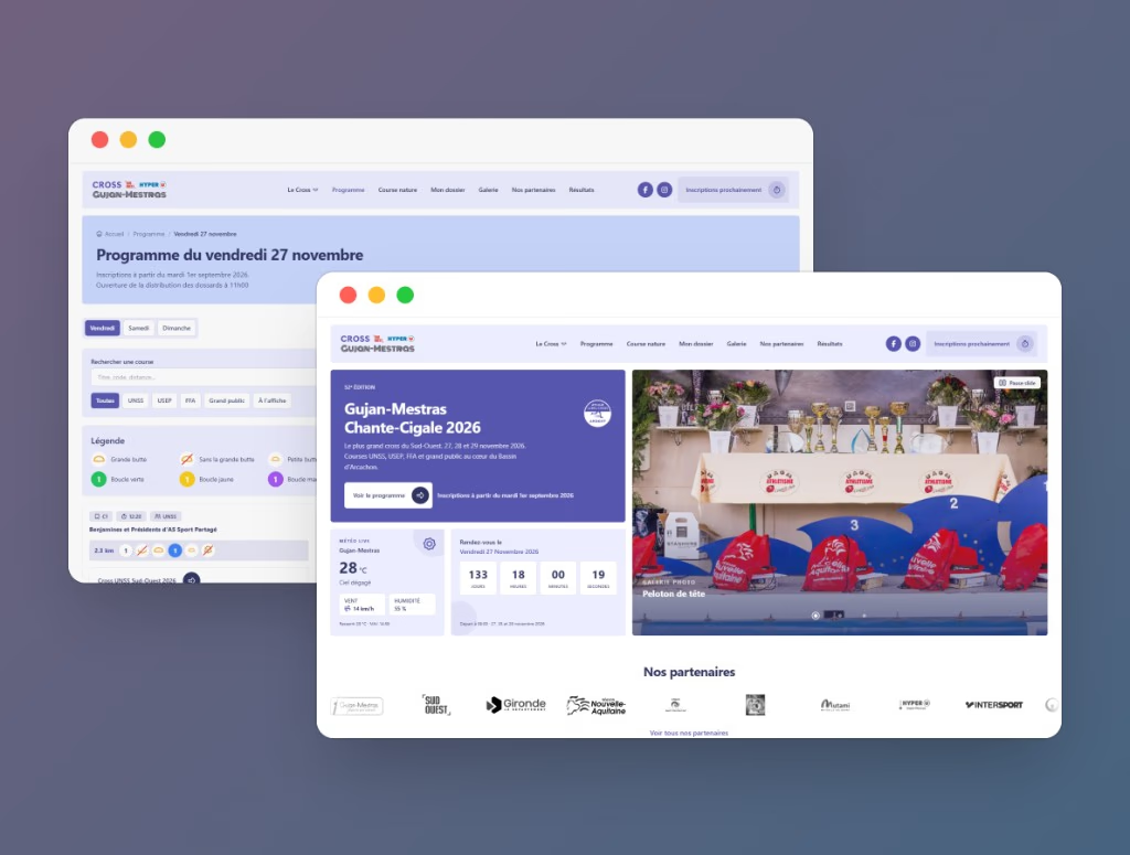
Cross Sud Ouest event site: violet/lavender identity, clear programme and registration journeys, smooth motion with React, Tailwind and GSAP, ClickUp-driven delivery. Scope focused on priority journeys and content readability.
Mission

Deliver a race showcase that is immediately readable (programme, practical info, registration) with a strong identity and purposeful motion, without slowing maintenance or pre-event shipping cadence.

Livraison

Clear journeys to discover the edition, programme and registration; UI aligned on the violet/lavender palette; maintainable front stack and ClickUp-secured releases through race day.

L'enjeu

Deliver a race showcase that is immediately readable (programme, practical info, registration) with a strong identity and purposeful motion, without slowing maintenance or pre-event shipping cadence.

Clear journeys to discover the edition, programme and registration; UI aligned on the violet/lavender palette; maintainable front stack and ClickUp-secured releases through race day.

A cross-country site must inspire and inform: convey race energy without sacrificing programme clarity or perceived performance. Framing set the priorities — visual hierarchy, mobile first, motion in service of the message — before shipping a modern front layer steered in ClickUp.

Contrainte métier

À compléter — budget, délais, conformité ou capacité équipe.

Frictions utilisateurs

À compléter — friction parcours, lisibilité, confiance.

Tension produit

À compléter — priorisation, dette technique, mesure.

Le parti pris

The challenge

Bring together brand identity, storytelling and participant journeys: controlled contrast, identifiable programme/registration blocks, and transitions that support reading without weighing down the experience or accessibility.

The response

Front development with React and Tailwind to structure sections and keep responsive consistency; GSAP to anchor race dynamism. The palette (#5756AF, #E0E1F9, #ECEDFF, white), Segoe UI and md radius (6px) form the shared visual frame. ClickUp aligns prioritisation, QA and releases.

What changed

A showcase aligned with the Cross Sud Ouest universe, ready for future editions, with a readable front stack and delivery steering that absorbs pre-event pressure.

Chiffres et écrans

Les chiffres qui comptent

Technical performance

+20 pts

Measured progression from 78% to 98% on this indicator.

Avant78%
Après98%

Accessibility

+19 pts

Measured progression from 77% to 96% on this indicator.

Avant77%
Après96%

Technical quality

+19 pts

Measured progression from 74% to 93% on this indicator.

Avant74%
Après93%

Performance globale

96%

SCORE /100

Excellent

Moyenne des indicateurs apres optimisation

Impact et résultats

  • Identity and readability. Segoe UI type hierarchy and brand colours applied consistently across blocks, interactive states and CTAs.
  • Purposeful motion. GSAP used for feel without compromising page structure or immediate understanding of calls to action.
  • Delivery-focused project steering. ClickUp as production backbone (prioritisation, tickets, validation) to secure shipping cadence in an event-critical context.

Avant / après : le contraste

The Cross Sud Ouest visual comparison highlights clearer hierarchy, more stable mobile rendering, and stronger emphasis on primary actions.

  • Block hierarchy is reinforced to speed up first-glance comprehension.
  • Primary CTAs are repositioned to reduce navigation hesitation.
  • Visual pacing is lighter to improve readability on mobile screens.
Cross Sud Ouest homepage evolution

Sous le capot

Process & réutilisabilité

Cross Sud Ouest pairs a maintainable React/Tailwind/GSAP front with ClickUp cadence to hold pre-event shipping pressure.

Event front foundation

React, Tailwind, GSAP

Critical sections (programme, registration, partners) are composed to stay readable and evolvable.

  • Reusable React blocks for day-by-day programme and registration CTAs.
  • Tailwind keeps responsive layout, palette and radius without visual drift.
  • GSAP drives reading rhythm and micro-interactions without overload.

Light design system

Segoe UI, violet/lavender, md radius

A short visual frame (type, colours, radius) speeds iteration without bloating the stack.

  • Segoe UI as the shared typeface for titles and UI.
  • Palette #5756AF / #E0E1F9 / #ECEDFF / white applied to CTAs and surfaces.
  • 6px (md) radius on buttons and interactive components.

Event-pressure delivery steering

ClickUp in operational flow

Daily steering targets shipping reliability and risk reduction as event date gets closer.

  • Short sprints prioritize participant-impact blockers first.
  • Dependencies between content and technical lots are tracked explicitly.
  • Progressive acceptance covers highest-stakes journeys before traffic peaks.
Design system
Cross Sud Ouest logo

Segoe UI

Aa

Heading 1

Heading 2

Heading 3

Main Body

Link

Button
Button
Nous contacter

Aperçu du site en ligne

La suite

Project learnings

  • Event-site performance depends on a clear front stack (React, Tailwind, GSAP), not visual polish alone.
  • A short design system (type, colours, radius) speeds iteration without slowing delivery.
  • Daily ClickUp arbitration reduces tunnel effects during pre-event pressure windows.

Recommended next steps

  • Extend programme/registration components for future editions without a redesign.
  • Instrument programme/registration interactions to refine content prioritization.
  • Introduce a weekly readiness checklist leading up to race day.