Contexte
Sport Passion Organisation runs multiple races around Bois de Vincennes, serving both returning runners and first-time participants.
Technos
En bref
Product framing, front-end architecture direction and UX/UI trade-off orchestration to turn the running showcase into a clear, maintainable decision journey.
Contexte
Sport Passion Organisation runs multiple races around Bois de Vincennes, serving both returning runners and first-time participants.
Mission
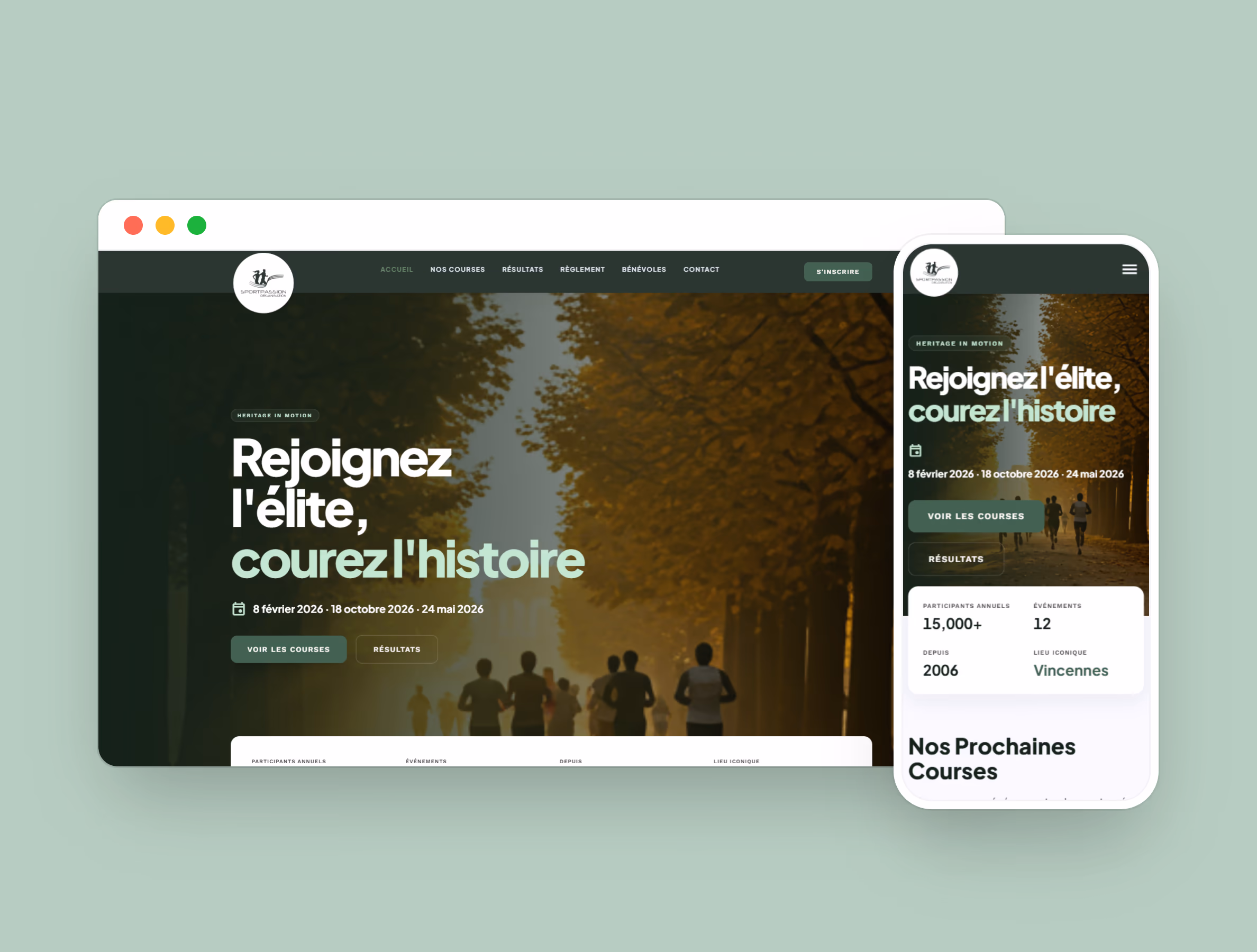
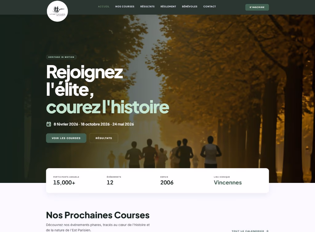
Redesign the showcase so users quickly understand where to act: discover races, check results, and move toward registration.
Livraison
React/Tailwind front-end rebuild, cohesive visual system, and motion patterns focused on comprehension and editorial scalability.
Express a polished sports brand without visual noise, keep mobile-first clarity, and use motion to reinforce the message rather than distract from it.
Clear paths to discover SPO, the race calendar and registration; UI aligned with the palette and card radius; a maintainable front-end foundation for evolving content and sections.
A running site must both inspire and inform: convey energy without sacrificing content clarity or perceived performance. Framing set the priorities—visual hierarchy, mobile-first layouts, motion in service of the message—before implementing a modern front-end layer.
À compléter — budget, délais, conformité ou capacité équipe.
À compléter — friction parcours, lisibilité, confiance.
À compléter — priorisation, dette technique, mesure.
Bring together brand, storytelling and user journeys in one experience: controlled contrast, scannable blocks, and transitions that support reading without hurting accessibility or perceived weight.
Front-end development with React and Tailwind to structure sections and keep responsive consistency; GSAP for the dynamic running feel. The palette (#2B3830, #41614C, #F9F9FF, white) and a 12px radius unify cards and buttons.
A showcase aligned with the SPO universe, ready to host new event content, with a clear stack for future iterations.
Technical performance
+20 pts
Measured progression from 80% to 100% on this indicator.
Accessibility
+20 pts
Measured progression from 80% to 100% on this indicator.
Technical quality
+19 pts
Measured progression from 77% to 96% on this indicator.
Performance globale
SCORE /100
Excellent
Moyenne des indicateurs apres optimisation
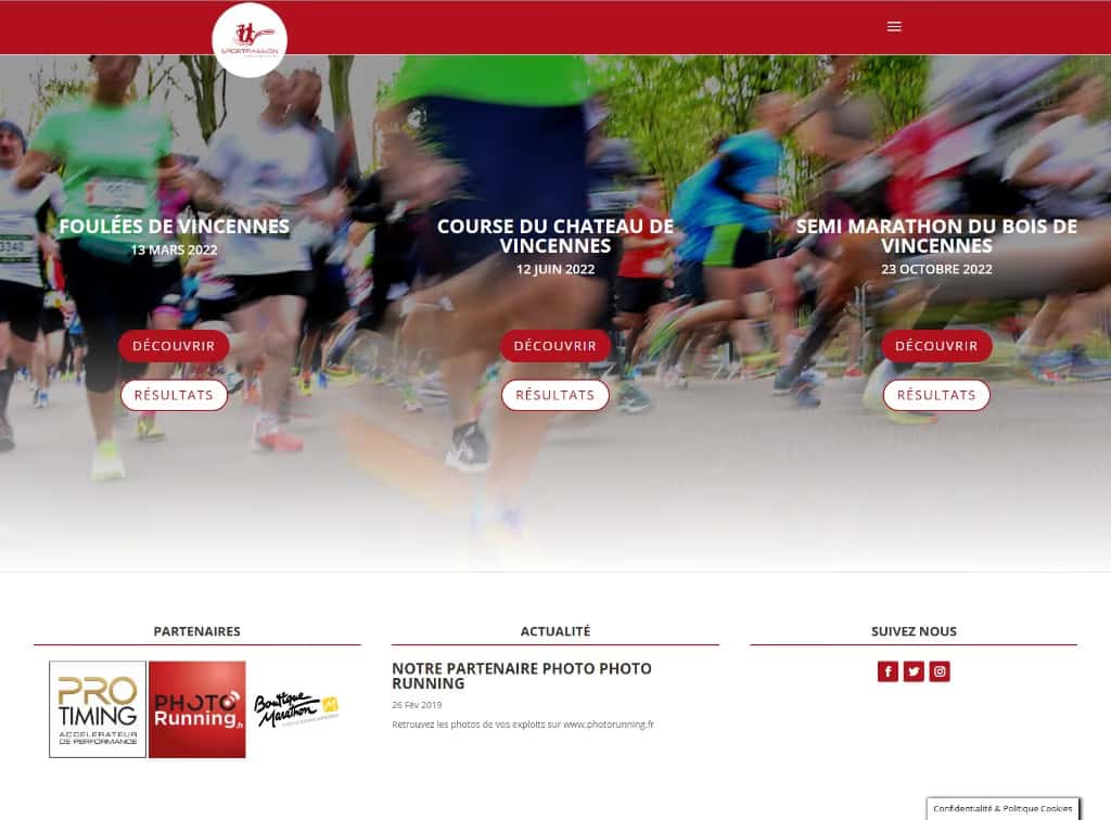
The legacy interface exposed dense information first. The redesign introduces stronger visual hierarchy so intent and action become obvious earlier.
SPO follows a short-loop editorial cadence centered on reading clarity: each iteration starts from a user decision objective and returns to concrete hierarchy, interaction and maintainability choices.
Vision, screen, validation
Work is paced in short cycles so visible decisions are secured before hidden debt accumulates.
Sustainable editorial system
Reuse is treated as explicit composition rules, not as visual copy/paste.
Long-run stability
Each release is assessed on reading impact and ability to iterate without global rewrites.
Plus Jakarta Sans, Inter, Work Sans
Aa
Heading 1
Heading 2
Heading 3
Main Body
Link
Ce site utilise des outils de mesure d’audience (Google Analytics 4) et d’expérience utilisateur (Microsoft Clarity), uniquement avec votre accord explicite. Politique de confidentialité.
Aucun cookie publicitaire ni de suivi individuel n’est utilisé : uniquement des statistiques anonymisées pour comprendre les usages du site.